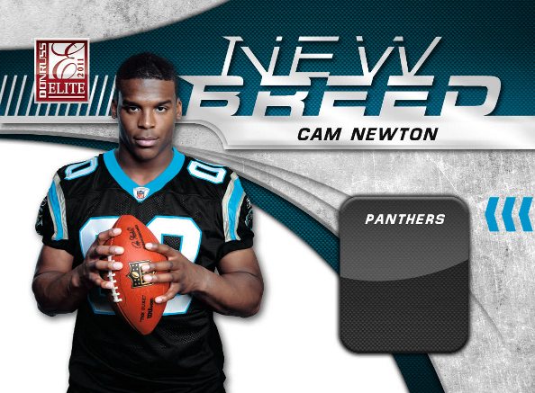
That didn't take long. Less than a week after photographing the top 2011 NFL rookies over the course of four days at the 2011 NFL PLAYERS Rookie Premiere in Los Angeles, Panini America officials already have incporated those images into New Breed, a 36-card insert set planned for the June 15 release of 2011 Donruss Elite Football.

That didn’t take long.
Less than a week after photographing the top 2011 NFL rookies over the course of four days at the 2011 NFL PLAYERS Rookie Premiere in Los Angeles, Panini America officials already have incporated those images into New Breed, a 36-card insert set planned for the June 15 release of 2011 Donruss Elite Football.
Although New Breed will be the inaugural trading-card destination for many of the photos acquired at the Rookie Premiere last week, collectors and fans can expect to see the fruits of the event all season long.
It’s worth noting that the photography in the gallery below was captured last Wednesday and Thursday, prior to the rookies receiving their “live” jerseys for Saturday’s expanded shoot, hence the “00” numbers. Regardless, we think you’ll find the following images to be no less captivating.
WOW!! Those look GREAT!!! I can imagine a jersey swatch in the black box area!!! Hint Hint!!
Wow , love it !!! Check out the shot of Miller….Hes making it look like the Ball is his baby or something….I love that shot of him !!!!…LOL
I want the whole set, from the base to jersey and patch parrallels if availble.
You guys should bring back hot boxes with complete insert sets or maybe complete jersey/patch redemption sets cards. That would be so sweet. ie 1995 donruss boxes. I know I loved it when I pulled the whole 95 Lumber company set in a pack. One of my top 5 packs of cards ever!!!!!
Will those have relic variants?
Yes, sir.
oooohhh sweeeet!
Will there be an auto version as well???
Dear Panini,
I know this probably won’t make the comments section, but I write this in the vain hope that someone there is listening with an open ear.
I understand you probably have a target audience for each of your products; a demographic that you cater to, but please, stop with the over abundance of tech designs and photoshop effects that were outdated 10 years ago. Even your “Classics” line has design elements that look decidedly not classic. I’d love have more Jake Locker cards to chase but, when most of your products look like something I can do in photoshop with my few years of experience, I have little desire to display it with the rest of my collection.
Also, I understand that it makes sense in terms of money and efficiency, but the single design with multiple variations makes certain variations of said card look vacant and off balance. I’m not saying a minimalistic design would be unwelcome, rather, when a design is clearly meant to have a swatch and/or autograph, the version lacking either ends up looking incomplete.
Anyways, thanks for listening.
“…when a design is clearly meant to have a swatch and/or autograph, the version lacking either ends up looking incomplete.”
The most recent examples that come to mind are Plates & Patches base and National Treasures “NFL Greatest” cards. Both cool products, but those cards detract in my opinion.
I agree with you completely on a lot of 2010 products and especially 2011 Prestige Connections cards, but in this set I LOVE the design. I think in years past Panini design staff would have placed a lot more “techy” design elements in the white 1/4 circle behind the players – rather than leave it white. I think this is a nice balance between a clean card and their traditional “techy” over-designed angled shapes look. Although a lot of their design do look VERY similar from set to set, year to year (unfortunately), I do really like these.
As for the lack of a “2ndary” design on cards without patches, autos or GU I do agree 100%. Especially because the majority of the cards out there are the non-jersey or non-auto versions. Would be nice to see an effort to make those look as nice and natural without the vacant areas that you mentioned. Hopefully on these New Breed cards the team logo will be in the grey box, or something to balance out the excellent design.
It would be AWESOME for Panini to hold a “design contest” for collectors and graphic designers (like myself) to possibly enter card designs and have them be voted on and inserted into the 2011 lineup. If not complete sets, than a insert set like these would be awesome. I know I would personally pour my heart and soul into some designs. To combine my 2 favorite things, card collecting and graphic design would be so much fun. If I ever saw a design of mine being pulled from packs and officially licensed, that would be BY FAR the highlight of my career.
Good PR move for Panini and they could possibly come up with future “design fuel” for their designers to work from. Makes sense to me… how bout you Tracy? You should post up 5 or so player photos, company logos and branding info so that pros and amateur designers alike can download and use… then let it rip!!
Sorry for the long posts, but I’m pretty passionate about cards and design 🙂
I SERIOUSLY love this design. Seeing these compared to what was on the original sell sheet is a night and day difference in deciding to buy some of this product for me. Well done.